Craft A Relative Frequency Distribution For Insightful Data Visualization
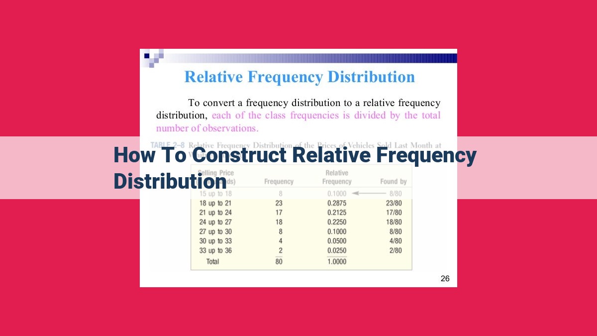
To construct a relative frequency distribution, first, determine the range of the data and divide it into bins of equal width. Then, calculate the relative frequency (count of data points within a bin divided by the total number of data points) for each bin. Finally, create a bar graph that represents the relative frequencies of each bin, creating a visual representation of the distribution of the data.
Understanding the Fundamentals of Relative Frequency Distributions
Data is like a treasure chest of information, and understanding it is crucial for making informed decisions. A dataset is a collection of data, typically representing a sample of a larger population. Each piece of data relates to a specific variable, such as height, age, or income.
Among the many ways to analyze data, one powerful tool is the relative frequency distribution. It’s a graphical representation of how often different values or categories occur within a dataset. To grasp this concept, let’s introduce the idea of relative frequency.
Relative frequency is like the probability of a specific value occurring in your dataset. It’s calculated by dividing the frequency of that value (how many times it appears) by the total number of observations in the dataset. Frequency is simply the raw count of occurrences, while proportion is similar to relative frequency but expressed as a percentage.
Understanding Relative Frequency Distributions
What is a Relative Frequency Distribution?
In the world of data analysis, understanding the underlying distribution of data is crucial. A relative frequency distribution is a powerful tool that provides a visual representation of the frequency of occurrence for different categories or intervals within a dataset. It helps us uncover patterns, identify outliers, and draw inferences about the larger population.
Types of Relative Frequency Distributions
There are several types of relative frequency distributions, each serving a specific purpose:
- Histogram: The most common type, a histogram displays the distribution of data in a series of adjacent rectangles. Each rectangle represents a specific bin, a range of values. The height of each rectangle corresponds to the relative frequency within that bin.
- Bar Chart: Similar to a histogram but used for categorical data. The bars represent the different categories, and their heights indicate the relative frequency of each category.
- Pie Chart: A circular graph that displays the relative frequency of each category as a proportion of the whole.
Understanding the type of distribution best suited for your data is essential for effective data visualization.
Bins and Bin Width: Carving Data into Meaningful Segments
In the world of data analysis, understanding how to categorize data into meaningful groups is crucial. Bins, also known as categories or intervals, play a vital role in a relative frequency distribution.
Just like sorting socks into piles based on color, bins help us organize data values into distinct segments. These segments, known as class intervals, represent ranges of data. For example, in a dataset of test scores, we could create bins for scores ranging from 0-10, 11-20, and so on.
The bin width determines the size of these segments. It’s calculated by dividing the range of the data (the difference between the highest and lowest values) by the desired number of bins. A smaller bin width results in more narrow segments, while a larger bin width creates broader segments.
Determining the appropriate bin width is key to creating a meaningful distribution. Too few bins can obscure valuable patterns, while too many bins can make the distribution difficult to interpret. Sturges’ Rule provides a starting point for determining the optimal bin width:
Bin width = (Range of data) / (1 + 3.3 * log(n))
Where n is the number of data points in the dataset.
Understanding bins and bin width is essential for constructing informative relative frequency distributions. These graphical representations help researchers visualize how data is distributed, identify patterns, and make informed decisions.
Step-by-Step Guide to Constructing a Histogram: A Journey to Unravel Data Distributions
Embarking on the adventure of data analysis, histograms emerge as invaluable tools, providing a panoramic view of your data’s distribution. Let’s delve into the odyssey of crafting a histogram, piece by piece.
Determining the Range: Mapping the Data Landscape
Begin by scrutinizing your data. The range, the difference between the greatest and least values, sets the stage for our histogram. Picture it as the breadth of your data’s canvas, stretching from one extreme to the other.
Dividing the Range: Slicing the Canvas into Bins
Next, subdivide the range into smaller sections called bins. These bins are like the compartments of a filing cabinet, each holding data points within a specific range. The bin width decides the size of these compartments, ensuring a balanced representation.
Calculating Relative Frequencies: Counting the Occupants
Now, let’s count the inhabitants of each bin. Relative frequency tells us the proportion of data points residing in each bin relative to the entire dataset. This fractional value reveals the distribution’s shape and central tendencies.
Visualizing the Frequencies: Painting a Bar Graph
To unveil the data’s story visually, we employ a bar graph. The height of each bar corresponds to the relative frequency in that bin. This pictorial representation paints a clear picture of the distribution’s peaks, valleys, and overall pattern.
From Data to Insight: Unlocking the Power of Histograms
Armed with our histogram, we uncover the hidden secrets of our data. It illuminates the central tendencies, such as mean and median, while highlighting outliers that deviate from the norm. Histograms help us understand the spread of the data and make inferences about the underlying population.
Applications Across Industries: Histograms in Action
Histograms find widespread use in diverse fields. From analyzing sales distributions in business to understanding patient demographics in healthcare, these visual aids empower professionals to decipher complex data and make informed decisions.
Applications and Benefits of Relative Frequency Distributions
In the realm of data analysis, understanding the distribution of data is paramount. Relative frequency distributions offer researchers a powerful tool to visualize and interpret the spread of data, enabling them to uncover valuable insights and patterns.
One key application of relative frequency distributions lies in data summarization. By organizing raw data into categories and calculating relative frequencies, researchers can quickly condense and simplify large datasets. This summary format allows for easier comparison and identification of trends or anomalies.
Moreover, relative frequency distributions serve as a foundation for probability and statistical inference. By understanding the distribution of data, researchers can make educated guesses about the likelihood of certain outcomes or the characteristics of a larger population. This information is crucial for informed decision-making and accurate predictions.
In practical terms, relative frequency distributions find applications across diverse industries and fields. For instance, in marketing, they help businesses understand customer demographics and preferences, leading to targeted marketing campaigns. In healthcare, relative frequency distributions shed light on disease prevalence and treatment effectiveness, guiding public health policies.
Overall, relative frequency distributions empower researchers with the ability to make sense of complex data. By providing a clear visual representation of the distribution of data, these distributions aid in data exploration, summarization, and inference.
Examples and Real-World Scenarios of Relative Frequency Distributions
In the realm of data analysis, relative frequency distributions serve as versatile tools, offering a pictorial representation of data patterns. These distributions find wide application across diverse industries and fields, empowering researchers and decision-makers alike.
Let’s delve into some compelling examples to illustrate their practical significance:
-
Healthcare: Relative frequency distributions are indispensable in understanding the distribution of illnesses among different age groups. By plotting the data on a bar chart, healthcare professionals can quickly identify high-risk populations and allocate resources accordingly.
-
Marketing: In the dynamic world of marketing, relative frequency distributions reveal the age, gender, and income distributions of a target audience. Armed with this knowledge, marketers can tailor campaigns to resonate with specific demographics, maximizing their effectiveness.
-
Education: Educators utilize relative frequency distributions to analyze student performance on tests and assignments. The resulting histograms provide visual insights into the distribution of grades, helping teachers identify areas where students need additional support.
-
Finance: Investment analysts rely heavily on relative frequency distributions to assess the risk and return profiles of different investments. By plotting the historical returns of a stock or fund, analysts can make informed decisions about diversification and asset allocation.
-
Manufacturing: In the manufacturing sector, relative frequency distributions are used to monitor the quality of products. By tracking the frequency of defects over time, manufacturers can quickly identify trends and implement corrective measures to maintain high standards.
The beauty of relative frequency distributions lies in their ability to simplify complex data and reveal hidden patterns. By visually representing the distribution of data, they empower decision-makers to:
-
Identify trends: Relative frequency distributions highlight patterns and trends that may not be apparent from raw data. This information is invaluable for predicting future outcomes and making informed decisions.
-
Compare groups: By comparing relative frequency distributions of different groups, researchers can identify similarities and differences between them. This comparative analysis helps in understanding population dynamics and drawing meaningful conclusions.
-
Make informed decisions: Armed with a clear understanding of data patterns, decision-makers can make evidence-based decisions. Relative frequency distributions provide a solid foundation for strategic planning and resource allocation.
In conclusion, relative frequency distributions are powerful tools that illuminate the complexities of data. By presenting data in a visually appealing format, they empower individuals across diverse fields to make informed decisions, understand patterns, and gain valuable insights. Their versatility and practicality make them indispensable tools in today’s data-driven world.