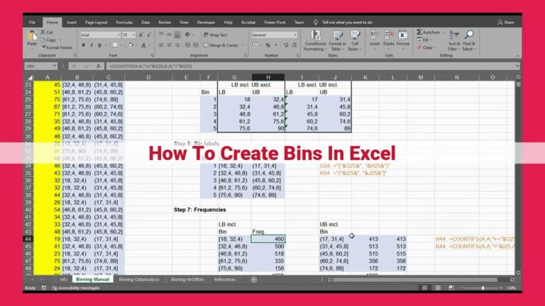
Mastering Frequency Analysis In Excel: A Comprehensive Guide
To find frequency on Excel, utilize the COUNTIF function to count occurrences of a specific value or multiple criteria. The FREQUENCY function generates frequency arrays and identifies the mode. Data validation ensures data integrity with frequency-related criteria. AutoFilter allows for filtering and sorting based on frequency. PivotTables summarize data by categories and display frequency counts. Advanced techniques, such as OLAP, cubes, and multidimensional databases, provide in-depth analysis of frequency distributions. Excel offers a comprehensive suite of tools to efficiently and accurately perform frequency analysis.
Understanding the Importance of Frequency Analysis: Unleashing Valuable Insights from Your Data
In the ever-evolving world of data analysis, frequency analysis plays a pivotal role in extracting meaningful insights from raw data. It unveils the patterns and trends hidden within your numbers, empowering you to make informed decisions and drive business outcomes.
Fortunately, Excel emerges as a powerful tool in your data analysis arsenal. Its robust features and intuitive interface make it an indispensable companion for frequency analysis, enabling you to effortlessly uncover the hidden stories concealed within your data. Dive into the world of Excel and unlock the power of frequency analysis today!
Key Subtopics:
- The Significance of Frequency Analysis in Data Analysis: Uncover the crucial role frequency analysis plays in revealing data patterns, identifying trends, and making data-driven decisions.
- Excel: Your Frequency Analysis Powerhouse: Explore the unique capabilities of Excel in facilitating frequency analysis, from simple functions to advanced techniques.
- Leveraging Excel’s Functions for Frequency Analysis: Discover the versatility of Excel’s functions, such as COUNTIF and FREQUENCY, for precisely counting occurrences and generating informative histograms.
- Enhancing Data Integrity with Data Validation: Ensure the accuracy of your frequency analysis by implementing data validation, establishing clear rules and eliminating errors.
- Simplifying Data Exploration with Filtering and Sorting: Utilize AutoFilter and sorting to quickly navigate your data, isolate specific values, and reveal patterns with ease.
- Summarizing Data with PivotTables: Transform large datasets into concise summaries using PivotTables, grouping data by categories and displaying frequency counts for in-depth analysis.
- Advanced Techniques for Frequency Analysis: Delve into the powerhouse capabilities of OLAP, cubes, and multidimensional databases for sophisticated analysis of frequency distributions from diverse perspectives.
Mastering Frequency Analysis with Excel: The COUNTIF Function
In the realm of data analysis, frequency analysis holds immense significance. It reveals the distribution of values within a dataset, offering valuable insights into patterns and trends. Excel, armed with its powerful functions, emerges as an indispensable tool for this task.
Enter the COUNTIF function, the workhorse for counting occurrences of specific values or meeting multiple criteria. Its syntax is elegantly simple:
=COUNTIF(range, criteria)
Range represents the cells you want to analyze. Criteria can be a specific value (e.g., “Apple”) or a logical expression (e.g., “>50”).
For instance, consider the formula:
=COUNTIF(A1:A10, "Apple")
It counts the number of cells in the range A1:A10 that contain the value “Apple”.
The COUNTIF function also excels in accommodating complex criteria. Consider the formula:
=COUNTIF(A1:A10, ">50")
This formula counts the number of cells in A1:A10 with values greater than 50.
By leveraging the COUNTIF function, you can unlock a world of possibilities for frequency analysis. It empowers you to identify the most frequently occurring values, uncover patterns, and make informed decisions based on data insights.
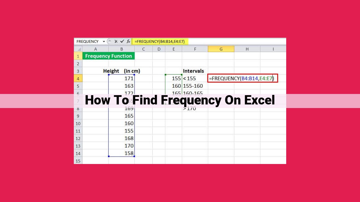
Exploring the Power of Excel’s FREQUENCY Function
In the realm of data analysis, delving into the intricacies of frequency distributions unlocks valuable insights. Among the many tools at our disposal, Microsoft Excel stands out as a formidable ally. In this article, we’ll embark on an exploration of the FREQUENCY function, a hidden gem that will illuminate the patterns within your data.
Unveiling the FREQUENCY Function
The FREQUENCY function is a statistical powerhouse, designed to create frequency arrays that reveal how often each unique value appears within a dataset. It takes an array as input, representing the range of values you wish to analyze. With a few simple arguments, you can harness its analytical prowess.
Illuminating Patterns with Histograms
Frequency arrays are not just mere numbers; they paint a vivid picture of data distribution. By plotting these arrays as histograms, we can visually observe the shape of the distribution. Histograms reveal patterns, such as central tendencies, skewness, and outliers. They provide a graphical representation of the underlying structure of your data, making it easier to draw meaningful conclusions.
Identifying the Mode: Uncovering the Most Frequent Value
One of the most valuable insights we can extract from frequency analysis is the mode, the value that occurs most frequently. The FREQUENCY function effortlessly calculates the mode by identifying the highest value in the frequency array. This information can be crucial in understanding the common characteristics or patterns within a dataset.
Beyond the Basics: Advanced Techniques
While the FREQUENCY function is a versatile tool on its own, it can be even more powerful when combined with other Excel features. PivotTables, for instance, allow you to summarize and group data by categories, making it easy to identify frequency distributions for specific subsets. Advanced tools like OLAP cubes and multidimensional databases also offer additional capabilities for analyzing frequency distributions from various perspectives.
Leveraging Excel’s Power for Informed Decisions
The FREQUENCY function is not just a mathematical tool; it’s a catalyst for deeper data exploration and understanding. By mastering its functionality, you can uncover hidden patterns, identify trends, and make more informed decisions backed by data. Remember, the true value of frequency analysis lies in its ability to transform raw numbers into actionable insights. So, embrace the power of Excel’s FREQUENCY function and unlock the secrets of your data today!
Enhancing Data Integrity with Data Validation
Importance of Data Validation for Frequency Analysis
When conducting frequency analysis, data integrity is paramount. Data validation safeguards the accuracy and consistency of your data, ensuring that your analysis is based on reliable information. By implementing data validation rules, you can prevent errors and ensure the quality of your results.
Types of Data Validation Rules for Frequency Analysis
Range Validation: Limit data entry to a predefined range of values. For example, if you expect frequency counts between 0 and 100, restrict data entry accordingly.
List Validation: Allow only specific values from a predefined list. This is useful for ensuring that frequencies are recorded using consistent categories.
Custom Validation: Create custom formulas to validate data based on complex criteria. For instance, you could check if the frequency entered is within an acceptable margin of error.
Benefits of Data Validation
- Improved Accuracy: Data validation reduces the risk of human error, leading to more accurate data and reliable analysis.
- Time Savings: Prevents unnecessary troubleshooting and data correction, saving time and effort.
- Increased Confidence: Data validation instills confidence in the results of your analysis, knowing that the data you’re working with is reliable.
Applying Data Validation in Excel
To apply data validation in Excel, follow these steps:
- Select the cells you want to validate.
- Go to the “Data” tab on the ribbon.
- Click on “Data Validation”.
- In the “Settings” tab, choose the desired validation type and criteria.
By implementing data validation rules, you can ensure that your frequency analysis is based on high-quality, accurate data. This will lead to more informed decision-making and reliable outcomes.
Filtering and Sorting with AutoFilter: Uncover Patterns with Ease
In the realm of data analysis, the ability to filter and sort data according to specific criteria is paramount. AutoFilter in Microsoft Excel emerges as a powerful tool that enables you to swiftly isolate and arrange data based on frequency, unlocking valuable insights.
AutoFilter allows you to quickly select rows or columns containing a particular value or range of values. By clicking on the dropdown arrow in the header of a column, you can display a list of distinct values present in that column. From this list, you can simply check the values you wish to include in your filtered view.
Sorting the filtered data further enhances your ability to identify patterns and trends. By clicking on the header of the column you wish to sort by, you can arrange the data in ascending or descending order. This visual organization makes it easier to compare values and spot anomalies.
Consider a scenario where you have a large dataset containing sales figures for different products. You can use AutoFilter to filter the data based on a specific product to isolate its sales performance. Sorting the filtered data in descending order will then allow you to quickly identify the top-selling products.
Similarly, you can use AutoFilter to exclude certain values from your analysis. By unchecking the corresponding values in the dropdown list, you can remove irrelevant data, ensuring that your analysis focuses on the most pertinent information.
AutoFilter is not only efficient but also intuitive to use. Its user-friendly interface and clear visual cues make it accessible to users of all levels. This ease of use allows you to spend less time manipulating data and more time deriving meaningful insights.
In conclusion, AutoFilter empowers you to quickly filter and sort data based on frequency, revealing patterns and anomalies with ease. Its intuitive interface and versatile functionality make it an indispensable tool for data analysts and anyone seeking to make informed decisions from their data.
Unveiling Patterns with PivotTables: A Powerful Tool for Summarizing Data
Embrace the Power of Frequency Analysis
Exploring data to uncover hidden trends and patterns is crucial for informed decision-making. Understanding the frequency of certain events or observations can provide invaluable insights. Excel’s PivotTables emerge as a game-changer in this context, offering interactive tools for summarizing large datasets and revealing frequency counts.
Introducing PivotTables: A Comprehensive Data Analysis Solution
PivotTables are dynamic and versatile tools that empower you to organize and present data in a meaningful way. They allow you to group data by different categories, such as products, regions, or time periods. By doing so, you can quickly uncover patterns and trends that might otherwise remain hidden.
Frequency Counts at Your Fingertips
One of the key capabilities of PivotTables is displaying frequency counts. By defining your categories and configuring the pivot table to show counts, you can easily determine how often each category appears in the dataset. This information is particularly valuable when you want to identify the most common values or observe the distribution of your data.
Illustrating the Power with an Example
Let’s consider a scenario where you have sales data for different products and want to analyze the frequency of sales for each product. By creating a PivotTable with Product as the category and Sale Value as the value field, you can quickly view the total sales for each product.
Additionally, you can drill down into each product category to explore the frequency of sales for specific types or attributes. This level of detail can help you understand which products are selling the most, their contribution to overall sales, and potential areas for improvement.
Summary: Unleashing the Analytical Potential
PivotTables are an indispensable tool for summarizing large datasets and identifying frequency counts. They empower you to group data into meaningful categories, uncover patterns, and make informed decisions based on your analysis. By leveraging the power of Excel and PivotTables, you can gain invaluable insights into your data and make more data-driven choices.
Advanced Techniques for Frequency Analysis
In the realm of data analysis, understanding the frequency of occurrences is crucial for uncovering patterns and making informed decisions. While Excel’s built-in functions provide a solid foundation for frequency analysis, advanced techniques like OLAP (Online Analytical Processing), cubes, and multidimensional databases can unlock even deeper insights.
OLAP Cubes
Imagine a data cube as a multidimensional container that organizes data into a hierarchical structure. Each dimension represents a different perspective, allowing you to analyze frequency distributions across multiple factors simultaneously. For instance, you could create a cube with dimensions for product category, region, and sales period. This would enable you to analyze sales frequencies from various angles, such as the most popular product categories in each region or the top-selling products during specific time frames.
Multidimensional Databases
Multidimensional databases are specialized data storage systems designed to handle complex, multidimensional data. They store data in a way that optimizes retrieval based on multiple dimensions. This allows for lightning-fast frequency calculations and the ability to analyze data from different perspectives with ease.
By leveraging these advanced techniques, you can gain a comprehensive understanding of your data’s frequency distributions. You can identify trends, patterns, and anomalies that might otherwise remain hidden. This enhanced insight empowers you to make data-driven decisions that drive business success.