Mastering Cumulative Frequency: A Guide To Enhanced Data Analysis
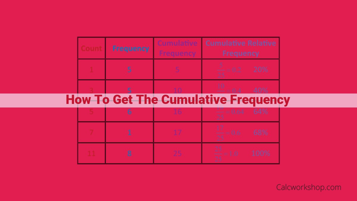
To determine the cumulative frequency, begin by calculating the frequency of each value or event in the dataset. Then, add the frequencies of each value and all preceding values to obtain the cumulative frequency. For instance, if a dataset has values 1, 2, 3, and 4 with frequencies 2, 3, 5, and 1, respectively, the cumulative frequencies would be 2 (for 1), 5 (for 2), 10 (for 3), and 11 (for 4). This cumulative frequency provides a running total of occurrences, enabling the calculation of percentiles, deciles, quartiles, and other statistical measures crucial for data analysis.
- Emphasize the importance of data analysis for making informed decisions.
- Define frequency, cumulative frequency, and percentiles as statistical measures used in data analysis.
Unlocking the Power of Data: Frequency, Cumulative Frequency, and Percentiles
In the realm of data analysis, understanding the frequency, cumulative frequency, and percentiles of your data is like having a roadmap to unravel its hidden patterns and insights. These concepts, though seemingly technical at first glance, are crucial for making informed decisions based on the story your data is telling.
Imagine you’re a data analyst hired by an online retailer to analyze their sales data. Your first task is to understand how often (frequency) customers purchase in a week. You tally the data and create a histogram, a graph that visualizes the frequency distribution, revealing that most customers purchase once or twice a week.
Next, you delve into cumulative frequency, which shows the total number of purchases made up to a certain point. This knowledge is essential for predicting demand and planning inventory. You find that 70% of customers purchase at least once a week, giving you a clear understanding of the retailer’s weekly sales volume.
But what if you need to focus on a specific segment of customers, like those who purchase the most? That’s where percentiles come in. Percentiles divide your data into equal sections. For example, the 90th percentile tells you that 90% of customers purchase less than a certain amount. Armed with this information, the retailer can tailor their marketing strategies to target high-value customers.
In summary, understanding frequency, cumulative frequency, and percentiles gives you a comprehensive view of your data, uncovering patterns, making sound predictions, and enabling data-driven decision-making. Embrace these statistical measures to unlock the power of your data and embark on a journey of informed decision-making.
Frequency and Histogram: Unveiling Patterns in Data
In the realm of data analysis, understanding the frequency and distribution of data points is crucial for making informed decisions. Frequency is the count of occurrences for a specific value or event within a dataset. By tallying these occurrences, we gain insights into the popularity or prevalence of different elements in our data.
Visualizing frequency distributions is where histograms come into play. Histograms are graphical representations that divide a data range into intervals and display the number of occurrences within each interval. These visual aids provide a clear picture of the data’s distribution, revealing patterns and trends that might otherwise go unnoticed.
For example, consider a dataset recording the heights of students in a classroom. Using a histogram, we can see how many students fall within different height ranges, such as 55-60 inches, 60-65 inches, and so on. This visualization allows us to quickly identify the most common height ranges, as well as any outliers that deviate significantly from the norm.
Histograms are a powerful tool for exploring data and uncovering hidden patterns. They help us understand the distribution of data, identify potential anomalies, and make inferences about the underlying population from which the data was drawn.
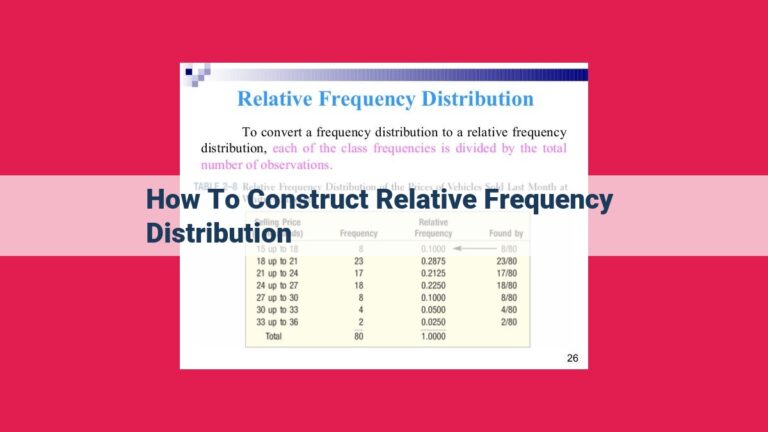
Cumulative Frequency and Relative Frequency: Exploring the Cumulative Distribution
Cumulative Frequency
Imagine you’re analyzing a dataset of exam scores. One way to understand the distribution of scores is to tally up the frequency of each score. Let’s say you find that 10 students scored 70, 15 scored 80, and 20 scored 90. The cumulative frequency for 80 is the total count of students who scored 80 or below. In this case, it’s 10 + 15 = 25.
Relative Frequency
Now, let’s express the cumulative frequency as a percentage of the total number of observations. The relative frequency for 80 is the cumulative frequency (25) divided by the total number of observations (45), giving us 55.56%. This tells us that 55.56% of the students scored 80 or below.
Understanding the Cumulative Distribution
The cumulative frequency and relative frequency together form a cumulative distribution, which graphically shows the proportion of observations that fall below or at a given value in the dataset. By examining the cumulative distribution, analysts can identify the majority of observations that fall within a certain range of values.
Example
Consider a dataset of sales figures for different products. The cumulative distribution of sales allows you to determine the percentage of sales contributed by each product or product category. This information can help businesses make informed decisions about which products to promote or invest in.
Understanding cumulative frequency and relative frequency is crucial for analyzing the distribution of data and making data-driven decisions. These concepts provide valuable insights into the cumulative distribution of values, enabling analysts to identify trends and patterns in the data.
Percentile, Decile, and Quartile: Unraveling the Secrets of Data Distribution
In the realm of data analysis, understanding the distribution of data is crucial for making informed decisions. Among the essential concepts that help us navigate this realm are percentiles, deciles, and quartiles.
Percentile: Dividing a Dataset into 100 Equal Parts
Imagine a dataset as a line of numbers arranged in ascending order. A percentile is a value that divides this line into 100 equal parts. For instance, the 25th percentile (P25) represents the value that divides the dataset into 25% of observations below and 75% above.
Decile: A Closer Look at 10 Equal Parts
Similar to percentiles, deciles divide a dataset into 10 equal parts. The 1st decile (D1) marks the point where 10% of the observations lie below, while the 9th decile (D9) indicates that 90% of the observations fall beneath it.
Quartiles: A Trio of Important Markers
Quartiles are percentiles that divide a dataset into four equal parts. The first quartile (Q1), also known as the 25th percentile, marks the point where 25% of the observations are smaller. The second quartile (Q2), also known as the median, splits the dataset in half, with 50% of the observations below and 50% above. The third quartile (Q3), or 75th percentile, represents the value at which 75% of the dataset lies beneath.
Applications of Percentiles, Deciles, and Quartiles
These concepts are indispensable tools for understanding data distribution and making meaningful comparisons. For instance, the median provides a more robust measure of central tendency than the mean for skewed datasets. Quartiles can identify outliers, while deciles can offer more granular insights into data distribution. In business, decile analysis can be used to create tiered marketing campaigns targeting specific customer segments.
In conclusion, percentiles, deciles, and quartiles are essential concepts for exploring the intricacies of data distribution. Understanding these measures empowers us to make informed decisions, identify trends, and gain a deeper understanding of the data we work with. By harnessing the power of these statistical tools, we can unlock valuable insights and navigate the complexities of data analysis with confidence.
Measures of Summary
Now that we’ve established a solid foundation in understanding frequency, cumulative frequency, and percentiles, let’s delve into the world of summary measures. These powerful metrics provide a concise snapshot of your data’s central tendencies and variability.
Median: The Middle Ground
Think of the median as the “fair and square” value that splits your data in half. Arrange your numbers in ascending order, and the median is the one right in the middle. It’s a robust measure, not easily swayed by extreme values.
Mean: The Average Joe
The mean, on the other hand, is the average of all your numbers. It’s calculated by adding them up and dividing by the total count. The mean is more sensitive to outliers, but it’s a commonly used measure for comparing datasets.
Mode: The Most Popular
The mode is the value that shows up the most in your data. It represents the most frequent occurrence. If you have a dataset of numbers, the mode is the number that appears more than any other.
Standard Deviation: Measuring Spread
Finally, we have standard deviation, which quantifies how much your data is spread out. A small standard deviation indicates that your data is clustered closely around the mean, while a large standard deviation suggests a wider dispersion.
Interquartile Range and Spread: Understanding Data Dispersion
In the realm of data analysis, it’s crucial to understand not only the frequency of occurrences but also how dispersed the data is. This knowledge helps us make informed decisions by capturing the data’s variability.
Interquartile Range (IQR)
Imagine a group of hikers on a trail, with some walking slowly and others striding ahead. The interquartile range (IQR) is like a measure of how spread out these hikers are. It’s calculated by finding the difference between the third quartile (Q3), the point where 75% of the hikers have passed through, and the first quartile (Q1), the point where 25% have gone by.
Spread
The IQR gives us a sense of the data’s spread or dispersion. A large IQR indicates that the data is widely scattered, while a small IQR suggests that the data is tightly packed together. This information is vital for understanding the data’s characteristics and making data-driven decisions.
For instance, if a company is analyzing sales data, a large IQR could indicate wide variations in sales performance across different regions or product categories. This insight can help them identify areas for improvement and tailor their marketing strategies accordingly.
Understanding frequency, cumulative frequency, percentiles, and related measures is essential for effective data analysis. These concepts help us not only count occurrences but also gauge data spread and distribution. By leveraging these concepts, we can make informed decisions, optimize processes, and gain a competitive edge in the data-driven business landscape.