Master Data Binning In Excel: A Comprehensive Guide For Data Analysis
To create bins in Excel, start by understanding data binning concepts. Determine bin width and edges using COUNTIF, MAX, and MIN functions. Calculate cumulative frequency for data insights. Measure percentiles to interpret data distribution. Visualize bins with histograms to depict frequency and distribution. Steps include selecting data, setting bin parameters, and generating a histogram to display binned data.
Understanding Data Binning:
- Definition and purpose of data binning
- Key concepts: bin edges, bin width, and frequency
Understanding Data Binning: A Simplified Guide
In the realm of data analysis, data binning plays a crucial role in organizing raw data into meaningful groups or bins. It’s a technique that simplifies data interpretation, making it easier to identify patterns, trends, and outliers.
Data binning involves dividing a continuous dataset into a set of contiguous intervals, called bins. Each bin has its own bin edges (the upper and lower boundaries) and bin width (the difference between the bin edges). Data points within each bin are then assigned a bin label indicating which bin they belong to.
Key Concepts in Data Binning:
- Bin Edges: The upper and lower limits of each bin, which determine the range of values included in that bin.
- Bin Width: The difference between the upper and lower bin edges, which specifies the size of each bin.
- Frequency: The number of data points that fall within each bin, indicating the distribution of data.
Understanding these concepts is essential for effectively binning data and extracting valuable insights.
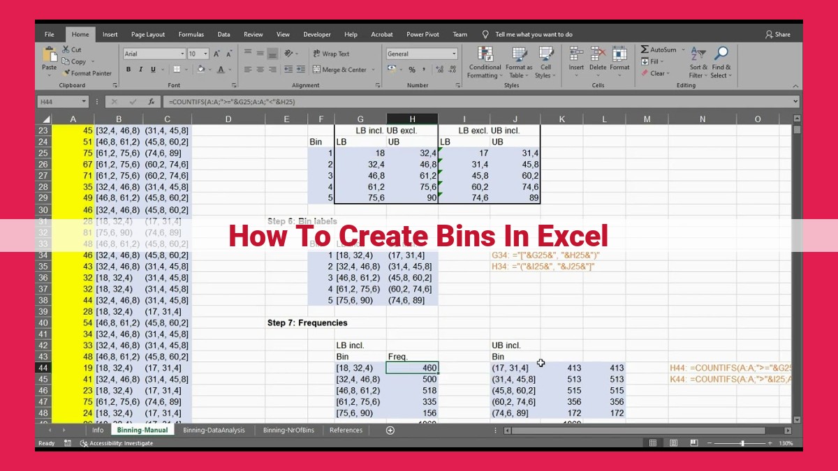
Binning Calculations in Excel: A Step-by-Step Guide
Understanding Bin Width and Bin Edges
To delve into binning calculations, let’s first establish two key concepts: bin width and bin edges. Bin width refers to the size of each bin, while bin edges define the lower and upper boundaries of each bin. These values play a crucial role in determining how your data is grouped and analyzed.
Formula for Calculating Bin Width
To calculate the optimal bin width, we use this formula:
Bin Width = (Maximum Value - Minimum Value) / Number of Bins
For instance, if your data ranges from 0 to 100 and you choose 5 bins, your bin width would be (100 – 0) / 5 = 20.
Determining Bin Edges
Once you have the bin width, you can compute the bin edges. The lower edge of the first bin is simply the minimum value of your data. Each subsequent bin edge is calculated by adding the bin width to the previous one.
Using Excel Functions to Automate the Process
To simplify these calculations, Excel provides several helpful functions:
- COUNTIF: Counts the number of data points within a specified range or bin.
- MAX: Returns the maximum value in a dataset.
- MIN: Returns the minimum value in a dataset.
By utilizing these functions, you can automate the binning process and ensure accuracy.
Example in Excel
Let’s put these concepts into practice using Excel. Suppose you have a dataset of exam scores ranging from 0 to 100. You want to create 5 bins.
- Calculate the bin width: (100 – 0) / 5 = 20
- Determine the bin edges: 0, 20, 40, 60, 80, 100
- Use COUNTIF to count the data points within each bin.
This process allows you to easily organize your data into meaningful bins, making it ready for further analysis and visualization.
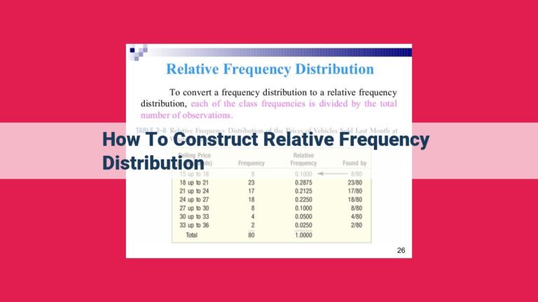
Determining Cumulative Frequency: Unraveling Data’s Hidden Patterns
In the tapestry of data analysis, cumulative frequency weaves a vibrant thread, revealing patterns that lie beneath the surface. It’s a powerful tool that unveils the hidden stories within your data.
Calculating the Cumulative Count of Data Points:
Imagine a vast sea of data, each point representing a unique value. Cumulative frequency embarks on a journey, counting these points one by one, accumulating their presence along the way. It begins with the lowest value, tallying up all data points until it reaches the highest. This journey culminates in a comprehensive count, capturing the sum of all occurrences within a given range.
Significance in Data Analysis:
Cumulative frequency illuminates the distribution of data. It unveils the frequency of values within specific intervals, providing insights into the concentration and spread of data points. This is particularly valuable in understanding skewness and kurtosis. Skewness indicates whether the data is tilted towards higher or lower values, while kurtosis reveals whether it’s more peaked or flat than a normal distribution.
Moreover, cumulative frequency forms the foundation for calculating percentiles. These are key statistical measures that divide data into equal parts, highlighting important thresholds and patterns within the dataset.
Measuring Percentiles:
- Definition and formula for calculating percentiles
- Role in data interpretation
Measuring Percentiles: Unlocking the Secrets of Data Interpretation
Percentile, a powerful statistical concept, unveils the hidden insights within your data. Picture this: you have a dataset of exam scores. Instead of getting lost in the sea of numbers, percentiles help you understand where each student stands relative to their peers.
Imagine you’re analyzing the results of a math exam. The median, which is the 50th percentile, tells you that half of the class scored above it and half below it. However, the 75th percentile, or Q3, reveals that 75% of the students scored below this threshold. This means that only 25% performed better than the 75th percentile.
Percentiles are not just about finding the middle ground. They help you identify patterns and compare different datasets. By calculating the interquartile range (IQR), which is the difference between the 75th and 25th percentiles, you can assess the variability within the data. A small IQR indicates a more consistent distribution, while a large IQR suggests a wider range of scores.
When it comes to data interpretation, percentiles serve as valuable tools. They allow you to:
- Compare different datasets on a common scale
- Identify outliers that deviate significantly from the norm
- Make predictions about future outcomes based on historical data
Mastering percentiles empowers you to analyze your data more effectively. They provide a deeper understanding of the distribution, variability, and relationships within your data, enabling you to make informed decisions and uncover valuable insights.
Visualizing Bins with Histograms: Unveiling Data Patterns
In the realm of data analysis, binning is a technique that transforms raw data into meaningful categories. It helps us understand data distribution and identify underlying patterns. One powerful way to visualize binned data is through histograms.
Histograms are graphical representations of data where the frequency of data points within each bin is plotted against the bin edges. They provide a clear picture of how data is distributed, revealing trends and outliers.
For instance, let’s consider a dataset of student test scores. By binning the scores into ranges, such as 0-10, 11-20, and so on, we can create a histogram. This histogram will graphically display the distribution of scores, showing the number of students who scored within each range.
The shape of the histogram tells us a lot about the data. A bell-shaped curve indicates a normal distribution, while a skewed curve suggests that the data is either heavily weighted towards higher or lower values. The histogram also helps us identify outliers, data points that fall significantly outside the main distribution.
Histograms are invaluable tools for data visualization and analysis. They allow us to quickly assess data distribution, compare different datasets, and make informed decisions based on the patterns they reveal. So, next time you’re dealing with binned data, don’t hesitate to leverage the power of histograms to unveil the insights hidden within.
Creating Bins in Excel Step-by-Step:
- Selecting data and choosing the binning method
- Setting parameters for bin width and number of bins
- Generating a histogram to visualize the binned data
Creating Bins in Excel Step-by-Step: A Comprehensive Guide
Data binning is an essential technique used to organize and summarize large datasets, making them easier to analyze and interpret. In this blog, we’ll delve into the step-by-step process of creating bins in Microsoft Excel, guiding you through the selection of data, parameter settings, and visualization of binned data.
Selecting Data and Binning Method
- Begin by selecting the range of data you wish to bin. This data should consist of numerical values.
- Choose a binning method that suits your data. Options include equal-width bins (segments of equal size), equal-frequency bins (segments containing an equal number of data points), and customized bins (user-defined segments).
Setting Parameters for Bin Width and Number of Bins
- Determine the bin width based on the range of your data. It represents the size of each bin interval.
- Specify the number of bins that you wish to create. Consider the size of your dataset and the level of detail you want to achieve.
Generating a Histogram to Visualize Binned Data
- Once bins are created, you can visualize the distribution of data using a histogram. A histogram displays the frequency of data within each bin.
- To create a histogram, select the binned data and go to the “Insert” tab in Excel.
- Choose “Histogram” from the “Charts” section and select the desired chart style.
Creating bins in Excel is a straightforward process that enables you to organize and analyze large datasets effectively. By selecting the appropriate data, setting bin parameters, and visualizing the binned data, you can gain valuable insights into the distribution and patterns within your data.