How To Identify Linear Tables: Calculating Slope, Intercept, And Correlation
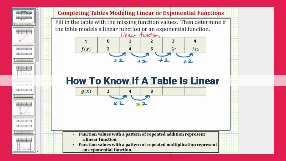
To determine if a table is linear, assess whether the data points form a straight line. This can be done by calculating the slope, which represents the constant rate of change between points, and identifying the y-intercept, the value where the line intersects the y-axis. These values should remain consistent throughout the table for linearity. Additionally, plotting the data on a graph or scatter plot can help visualize the linearity, and calculating the correlation coefficient can indicate the strength of the linear relationship.
Unlocking Linearity: A Guide to Understanding and Interpreting Data
In the realm of data analysis, identifying and understanding linear relationships is of paramount importance. A linear relationship exists when two variables exhibit a constant rate of change, meaning that as one variable changes, the other changes in a proportional manner. This concept of linearity is pervasive in various fields, from science and mathematics to economics and business.
Why is understanding linearity so crucial? Linearity allows us to make meaningful predictions, draw informed conclusions, and model real-world phenomena. By recognizing linear patterns in data, we can uncover insights that would otherwise remain hidden. Moreover, linearity simplifies mathematical calculations and enables us to apply powerful statistical techniques.
Understanding Slope: The Key to Unlocking Linearity
Linear relationships are like the blueprints of our world, shaping everything from the growth of plants to the trajectory of a thrown ball. Understanding slope, a fundamental concept in linear relationships, is like having the magic key that unlocks these blueprints.
Let’s dive into the definition of slope. Imagine a straight line connecting two points. The slope of this line measures the steepness of the line. It tells us how much the line rises or falls vertically for every horizontal unit.
In mathematical terms, slope is calculated by dividing the change in the y-coordinate (vertical change) by the change in the x-coordinate (horizontal change). It’s often represented by the symbol m.
Another way to think about slope is as the gradient of the line. The steeper the line, the greater the gradient and the higher the slope. Similarly, a line with a gentle slope has a lower gradient.
Slope is also a measure of the rate of change. For instance, if the slope of a line representing population growth is 2, it means that for every unit of time, the population increases by 2 units.
Understanding slope is crucial because it helps us make sense of linear relationships. It tells us how quickly or slowly a variable is changing in relation to another. By mastering this concept, we unlock the power to predict trends and draw meaningful conclusions from data.
Introducing the Y-Intercept: The Baseline of Linearity
In the realm of linear relationships, where data plots a predictable path, the y-intercept holds a pivotal role. It serves as the anchor point where a line intersects the y-axis, representing the constant value that remains unaffected by changes in the independent variable.
This intersection point provides valuable insights into the graph’s behavior. It indicates the offset from the origin, revealing the starting value of the dependent variable when the independent variable is zero. This constant value acts as a baseline against which the line’s slope and direction can be measured.
Understanding the y-intercept is crucial for comprehending the overall shape of a linear relationship. It helps determine whether the line is increasing or decreasing, and by how much. By pinpointing this key intersection, we gain a clearer picture of how the data behaves when one variable is held constant.
In practical terms, the y-intercept finds applications in diverse fields, from scientific data analysis to economic forecasting. It enables researchers to make predictions and draw conclusions based on the observed linear trends. By isolating the constant component of the equation, we can better understand the underlying relationships and make more informed decisions.
So, whether you’re navigating the intricacies of a research project or simply trying to make sense of some data points, remember the significance of the y-intercept. It’s the foundation upon which linear relationships rest, providing a window into the constant factors that shape the world around us.
The Crux of Linearity: Unveiling the Equation
The essence of a linear relationship lies in its predictable pattern, where for every change in one variable, there’s a constant rate of change in the other. This consistent change is the slope, and the starting point is the y-intercept.
The linear equation encapsulates this relationship through the familiar structure: y = mx + b. Here, the slope, m, represents the rate of change in y as x changes. A positive slope indicates an upward trend, while a negative slope shows a downward pattern.
The y-intercept, b, denotes the y-axis coordinate where the line intersects the axis. This represents the starting point of the linear relationship.
Intriguingly, the slope and y-intercept hold a crucial relationship. The slope determines the steepness or gradient of the line, while the y-intercept indicates its offset from the origin.
Understanding this equation is pivotal in uncovering linear patterns and drawing meaningful insights from data.
Graphs and Scatter Plots
- Types of graphs and scatter plots
- Usefulness in determining linearity
Graphs and Scatter Plots: Unveiling Linearity
To determine the linearity of a relationship, we often turn to visual representations known as graphs and scatter plots. These tools provide a valuable glimpse into the behavior of data points and can reveal patterns that may not be apparent from numerical values alone.
Types of Graphs
- Bar charts: Vertical or horizontal bars represent the frequency or magnitude of data points.
- Line graphs: Points are connected by lines, showcasing trends and changes over different values.
- Scatter plots: Individual data points are plotted on a two-dimensional graph, highlighting the relationship between two variables.
Usefulness in Determining Linearity
Scatter plots are particularly useful in assessing linearity. A linear relationship exists when the data points form a straight line or a curve that appears close to a straight line. If the plotted points form a random pattern or a clear curve, linearity may not be present.
- Positive Linearity: Points rise from left to right, indicating that as the value of one variable increases, the value of the other variable also increases. The slope of the line will be positive.
- Negative Linearity: Points fall from left to right, indicating that as the value of one variable increases, the value of the other variable decreases. The slope of the line will be negative.
- Non-Linearity: Points do not form a straight line or a curve that resembles a straight line. The relationship between the variables is not linear.
By analyzing the distribution of data points on graphs and scatter plots, we can make informed judgments about the linearity of a relationship. This understanding is crucial for making accurate predictions and drawing conclusions from data.
Correlation Coefficient: Measuring the Strength of Linear Relationships
In the realm of data analysis, understanding linear relationships is paramount. One crucial tool in this endeavor is the correlation coefficient, a statistical measure that quantifies the strength and direction of the linear association between two variables.
The correlation coefficient, denoted by r, ranges from -1 to 1. A positive correlation indicates that as one variable increases, the other also tends to increase. Conversely, a negative correlation suggests that an increase in one variable corresponds to a decrease in the other.
The magnitude of the correlation coefficient signifies the strength of the relationship:
- |r| = 0: No linear relationship
- 0 < |r| < 0.5: Weak correlation
- 0.5 < |r| < 0.8: Moderate correlation
- 0.8 < |r| < 0.9: Strong correlation
- |r| = 1: Perfect correlation
It’s important to note that correlation does not imply causation. While a strong correlation may suggest a causal relationship, it does not prove it. Other factors may be responsible for the observed correlation. Therefore, exploring causality requires further analysis and investigation.
Determining Linearity
Understanding whether a relationship is linear is crucial for accurate data analysis and drawing meaningful conclusions. Assessing linearity involves using the concepts of slope, y-intercept, and correlation coefficient.
-
Examine the Scatter Plot: Plot the data points on a scatter plot to visualize the relationship. If the points form a straight line, it suggests linearity.
-
Calculate the Correlation Coefficient: This statistical measure indicates the strength and direction of the relationship between the variables. A correlation coefficient close to 1 or -1 indicates a strong linear relationship, while a value close to 0 suggests weak or no linearity.
-
Check for Outliers: Identify any data points that significantly deviate from the overall trend. These outliers can affect the linearity assessment, so remove or adjust them as appropriate.
-
Use Regression Analysis: Fit a linear regression model to the data. The model will provide the equation of the line, including the slope and y-intercept. If the model has a high R-squared value, it indicates that the relationship is linear.
Accurately determining linearity is essential for making reliable predictions and drawing sound conclusions from data. It allows analysts to identify trends, make projections, and understand the underlying relationships within the data.